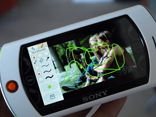
 The Mylo 2, like its predecessor, is a portable internet communicator. This one is more powerful, but it's still a freak of nature. It throws in a few internet functions here, some media player features there, and tops the thing off with a camera.
Some of its key features include:
- 3.5-inch, 16:9 touchscreen
- 802.11 b/g wi-fi
- Instant Messenger and Skype compatibility
- Music and video functionality
- 1.3 MP Camera with simple photo editor
- Flash video compatibility (YouTube, Daily Motion, etc...)
That's a long list of laundry, but it isn't a phone and can't even tether to handsets via Bluetooth, so you're restricted by wi-fi accessibility. The $299 device carries a similar shape to the PSP, with a sliding keyboard underneath and the camera on the backside. This is a pretty good piece of hardware that more or less works as it should, but I thought a few of its key features weren't up to par.
It sits nicely in the hand – not too big or heavy. The keys on the key board are well defined and logically placed, though I could do with a dedicated row of number keys. There are a series of permanent hotspots on the touchscreen that bring up various shortcuts/context menus without eating up too much of the screen. It has a 4-way directional nub with a center click feature to speed up the navigation process when the touchscreen won't do. There were a few buttons, such as the camera button and the wi-fi on/off switch, that made the design a little busy and could have been taken care of by the touchscreen or nub.
 The biggest hardware complaint about the Mylo 2 is that its touchscreen is pretty unsophisticated. It's not enough anymore to slap a touchscreen on a gadget and expect people to be impressed. In the web browser and instant messaging, zooming and scrolling took a ridiculously long time. I finally got used to finding the onscreen navigation buttons but it doesn't mean I liked it.
The lack of bluetooth also puzzled me a little. Adding bluetooth to Mylo 2 seemed pretty logical with the rise of bluetooth headphones, cellphone tethering and VoIP headsets. Sony said they wanted to keep costs down and the user experience simple. Adding bluetooth doesn't strike me as being that expensive, or complicated, but whatever.
Software is a mixed bag with the Mylo. The general UI is easy to navigate and generally intuitive. Sony even threw in a widget-like section with quick links to Facebook, Google, Youtube and Wikipedia. Instant messaging works pretty well by giving a 1/3 of the screen to contacts and the other 2/3 to the conversation window. But I couldn't find a way to add new buddies or sending a message to anyone not on my buddy list.
The music and video apps are no frills additions that work pretty well. They aren't mindblowing by any stretch of the imagination, and there are better options for those specific functions, but as an add on for an internet-focused device, it works well.
 The camera app is similar in interface to a cameraphone. Zoom functions are carried out on the touch screen and there is a mode that lets you make basic edits after you snap the photo. Again, no frills, but it works.
Web browsing is the one software feature that really disappoints. Navigating web pages tends to be choppy and the on screen nav buttons at the bottom can be unresponsive at times.
Sony also worked with Adobe to get flash video up and running on the Mylo 2, but the machine is a bit underpowered to handle the load. Many of the YouTube videos were littered with encoding errors that shouldn't have been there. The bigger the video size, the more choppy it got.
The Mylo 2 is a lot better than the Mylo 1, but its still a device without an identity. Is it a computer? No. Is it an MP3 player? Kind of, but not really. Is it appealing on the basis of its internet function alone? With a laggy browser and without a solution for mobile internet, I'm hesitant to say yes. Sony has the right ideas in place, but the Mylo needs some polish before it's ready for primetime.
Source- http://gizmodo.com/339855/mylo-2-has-new-design-touchscreen-flash-support
It sits nicely in the hand – not too big or heavy. The keys on the key board are well defined and logically placed, though I could do with a dedicated row of number keys. There are a series of permanent hotspots on the touchscreen that bring up various shortcuts/context menus without eating up too much of the screen. It has a 4-way directional nub with a center click feature to speed up the navigation process when the touchscreen won't do. There were a few buttons, such as the camera button and the wi-fi on/off switch, that made the design a little busy and could have been taken care of by the touchscreen or nub.
 The biggest hardware complaint about the Mylo 2 is that its touchscreen is pretty unsophisticated. It's not enough anymore to slap a touchscreen on a gadget and expect people to be impressed. In the web browser and instant messaging, zooming and scrolling took a ridiculously long time. I finally got used to finding the onscreen navigation buttons but it doesn't mean I liked it.
The lack of bluetooth also puzzled me a little. Adding bluetooth to Mylo 2 seemed pretty logical with the rise of bluetooth headphones, cellphone tethering and VoIP headsets. Sony said they wanted to keep costs down and the user experience simple. Adding bluetooth doesn't strike me as being that expensive, or complicated, but whatever.
Software is a mixed bag with the Mylo. The general UI is easy to navigate and generally intuitive. Sony even threw in a widget-like section with quick links to Facebook, Google, Youtube and Wikipedia. Instant messaging works pretty well by giving a 1/3 of the screen to contacts and the other 2/3 to the conversation window. But I couldn't find a way to add new buddies or sending a message to anyone not on my buddy list.
The music and video apps are no frills additions that work pretty well. They aren't mindblowing by any stretch of the imagination, and there are better options for those specific functions, but as an add on for an internet-focused device, it works well.
 The camera app is similar in interface to a cameraphone. Zoom functions are carried out on the touch screen and there is a mode that lets you make basic edits after you snap the photo. Again, no frills, but it works.
Web browsing is the one software feature that really disappoints. Navigating web pages tends to be choppy and the on screen nav buttons at the bottom can be unresponsive at times.
Sony also worked with Adobe to get flash video up and running on the Mylo 2, but the machine is a bit underpowered to handle the load. Many of the YouTube videos were littered with encoding errors that shouldn't have been there. The bigger the video size, the more choppy it got.
The Mylo 2 is a lot better than the Mylo 1, but its still a device without an identity. Is it a computer? No. Is it an MP3 player? Kind of, but not really. Is it appealing on the basis of its internet function alone? With a laggy browser and without a solution for mobile internet, I'm hesitant to say yes. Sony has the right ideas in place, but the Mylo needs some polish before it's ready for primetime.
Source- http://gizmodo.com/339855/mylo-2-has-new-design-touchscreen-flash-support
0 comments
Post a Comment